Overview
The Mu is a nonprofit organization (NPO) based in a pop-up city that aims to address real-life problems using technology and resources from Web3.
The Mu team decided to host MuBuenos in Buenos Aires, capital of Argentina, a country facing economic instability with its currency.
Location
Remote
Buenos Aires, Argentina
Tools
Figma, Illustrator Procreate
Role
Branding, visual design
Timeline
Overall : +1 month
Branding inspiration
Due to past government policies, Argentina's economy has collapsed. While conducting research for branding, I sensed an energy in Argentina that seeks reform and change.
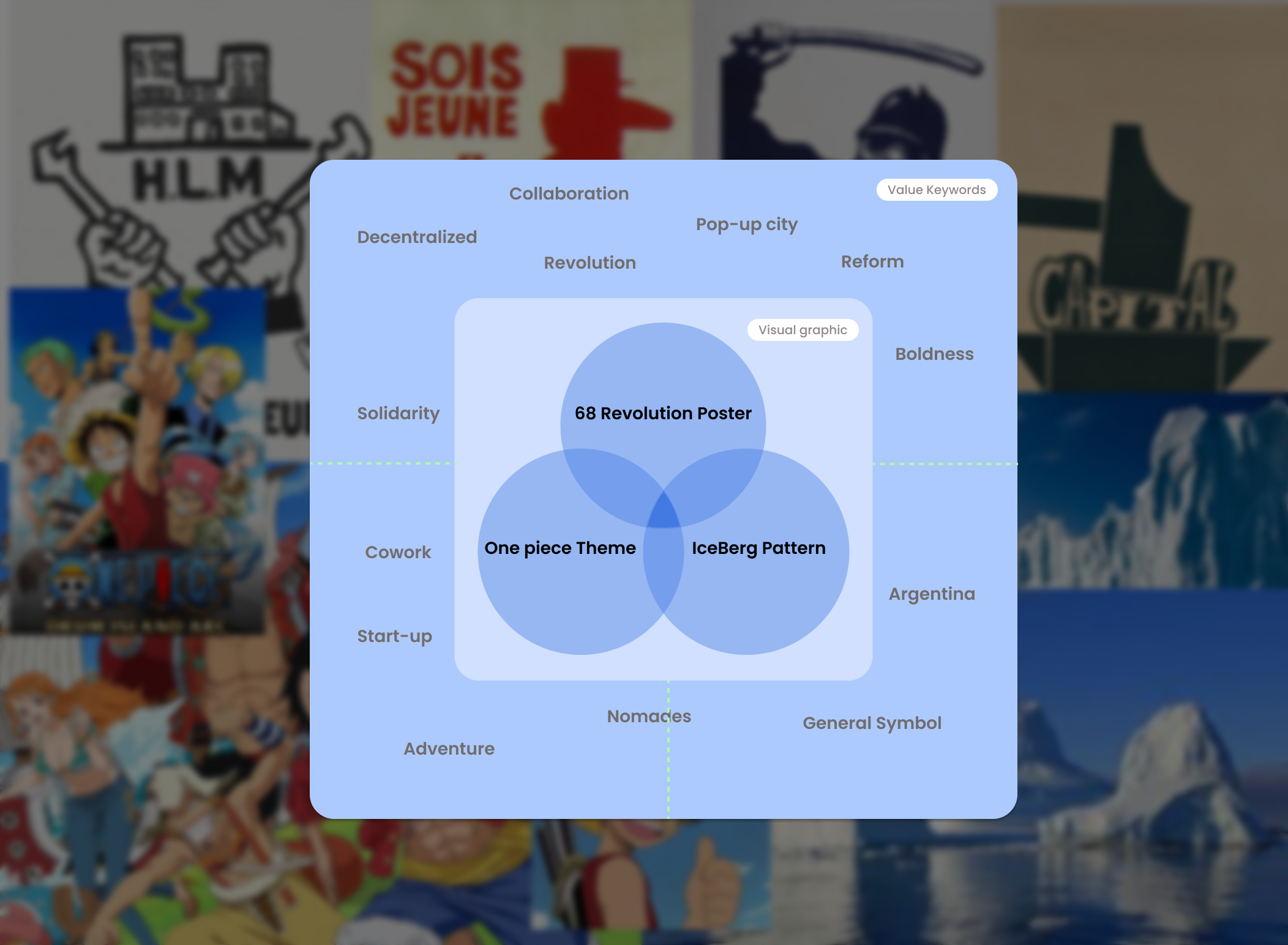
Considering this local atmosphere and the branding of the event based on the Web3 community, the following keywords were considered for the visual identity 👉
Reform not revolution.
Solidarity without central government.
Energy
Diversity
Real-life problem solver
BI Concept
Make a change in Real life, Solidarity and Diversity
Inspiration
Adopting visual concepts commonly seen in protests demanding social and political change, we aimed to convey the energy of seeking change.
Superficially, it evokes the shape of an iceberg symbolizing Argentina, but internally, the goal was to convey the sharp liveliness typical of the Japanese anime 'One Piece,' which I felt could effectively express the nature of the event within the team.
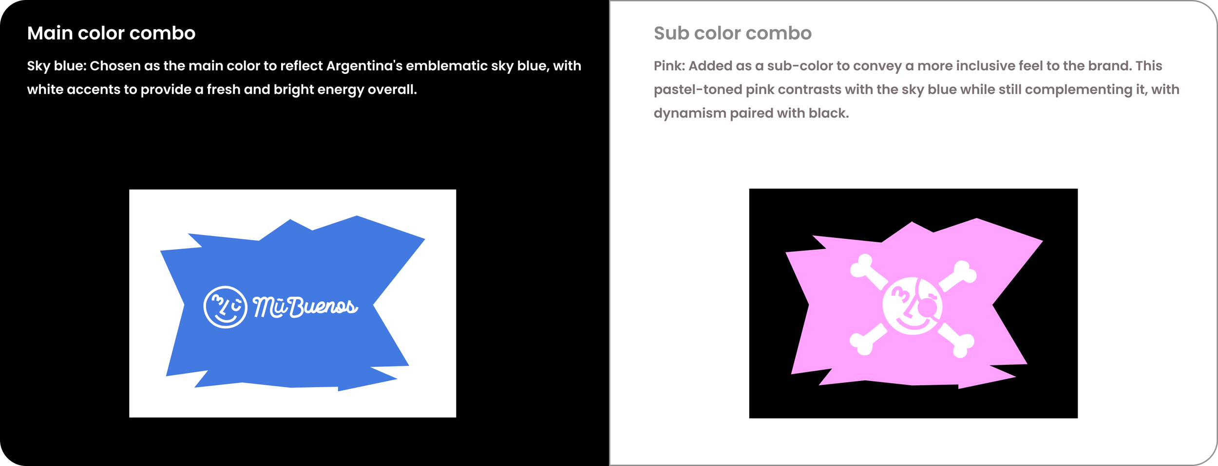
Color
Typography
Opensans
Open sans font represents core values of The MuBuenos ; Openness, Neutral and Friendly. This humantic sans-serif typography ‘s space balance allows to deliver the open-growth mindset with its high legibility.
Production Making
💡 Idea supposed_1 :
Let’s enjoy the large space!
Considering the high interest in crypto in the country where the event is held, various methods to promote the event as much as possible were considered in the beginning.
However,
Not being able to visit the completed site in person while designing introduced many variables to contend with. Additionally, unforeseen administrative factors needed to be considered.
Contrary to initially considering ways to maximize the use of the space, the consideration expanded to include not only event participants but also other users of the coworking space. It was necessary to think about how shared spaces could be showcased without being 'intruded upon' by a particular event.
💡 Idea supposed_2:
Version iterated
I pondered on how to design merchandise that naturally encourages other users to enjoy the event as well. Given the co-working space's aversion to 'large sizes' and 'installations', I leaned towards a more interactive approach with 'smaller sizes' and 'mobile' characteristics. I thought it would be great if people could interact with the merchandise in a more interactive way.
Marketing Asset
This combination of themes formed the visual identity of mubuenos and was utilized in various aspects. In SNS marketing, it was used as a template to emphasize partnerships using the onepiece theme and mubuenos' visual concept.
Merch Asset
Additionally, it was designed based on the visual concept for door posters that can guide various spaces in coworking spaces.
Learn & Lesson
Over the course of about two months working with my team at Mubuenos, I've pondered extensively on how to make people intuitively grasp and remember The Mu's vibe moving forward. Despite budget constraints and hiccups in the production process, overseeing the graphic design for the event for the first time allowed me to learn a lot.
The biggest lesson was that managing the event graphic design should be more considered than production itself. Considering these processes, I aim to lead discussions within the team, dedicating more time to planning and discussing the feasibility of actual design implementation in the future.


